ZEPTO REBRANDING
ZEPTO REBRANDING
ZEPTO REBRANDING
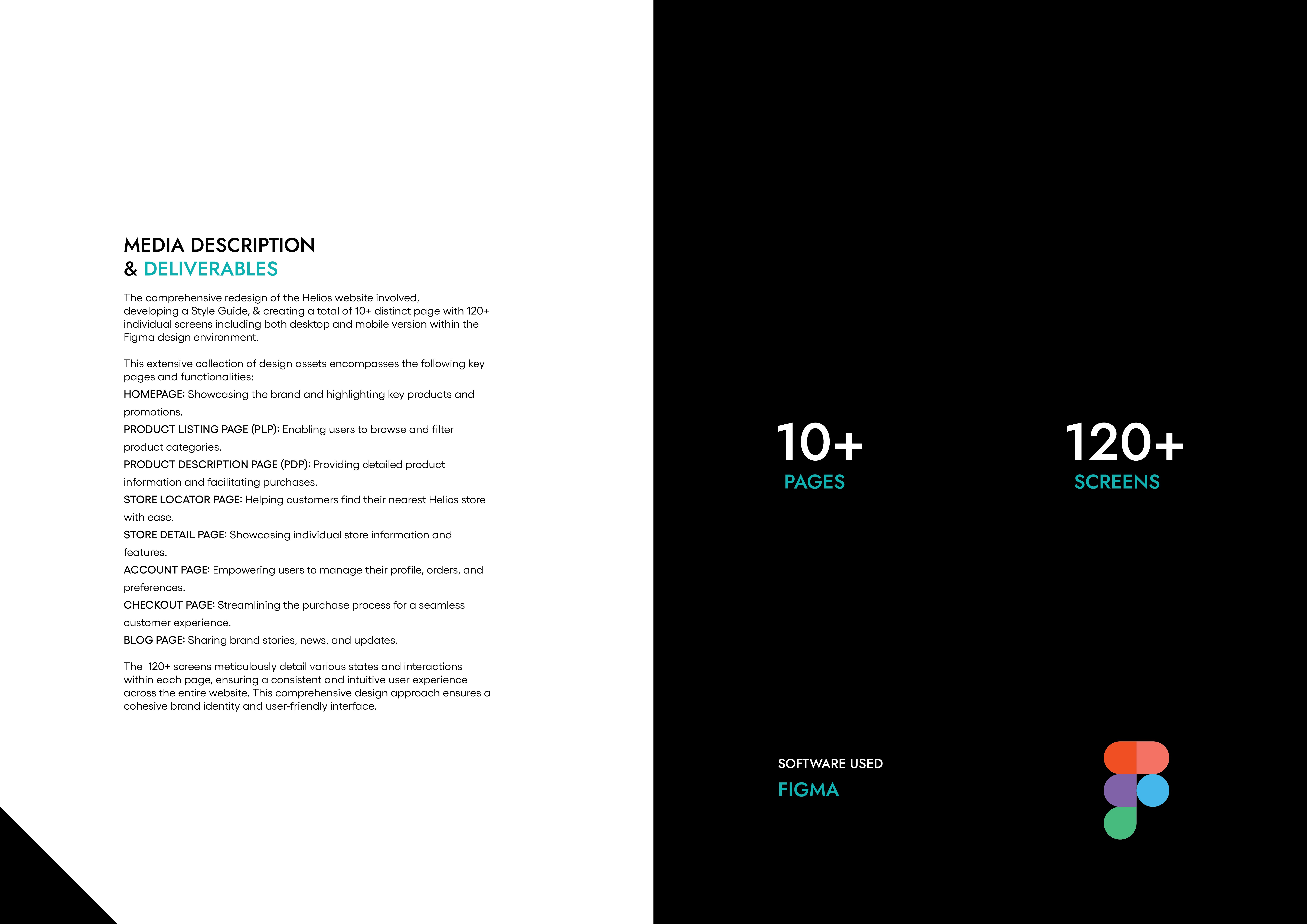
Zepto is a quick commerce brand that promises delivery in 10 minutes. This project focuses on refining its visual identity to emphasize speed, efficiency & convenience.
Zepto is a quick commerce brand that promises delivery in 10 minutes. This project focuses on refining its visual identity to emphasize speed, efficiency & convenience.
Zepto is a quick commerce brand that promises delivery in 10 minutes. This project focuses on refining its visual identity to emphasize speed, efficiency & convenience.

Year
2023
worked for
ZEPTO
Category
Branding & Identity
Project Duration
3 - 4 Weeks
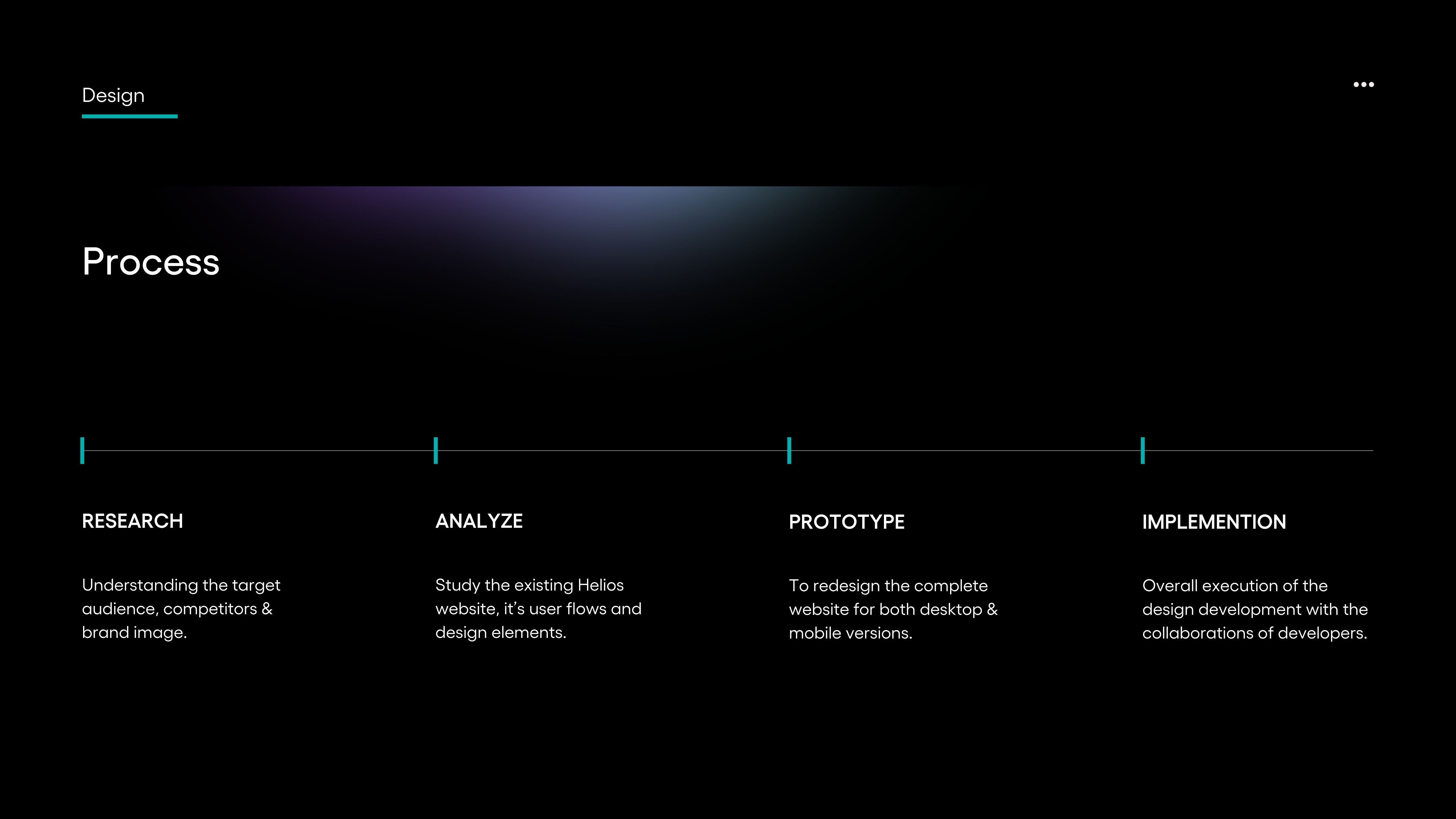
Approach
Approach
This project was driven by an intuitive approach to enhancing Zepto’s brand identity. The focus was on creating a modern and impactful visual style that reflects the brand’s speed and efficiency. The rebranding process was guided by industry trends, visual experimentation, and an understanding of Zepto’s positioning in the market.
This project was driven by an intuitive approach to enhancing Zepto’s brand identity. The focus was on creating a modern and impactful visual style that reflects the brand’s speed and efficiency. The rebranding process was guided by industry trends, visual experimentation, and an understanding of Zepto’s positioning in the market.

Pages
Pages
Pages
Screens
Screens
Screens
Increase in Website Traffic
Increase in Website Traffic
Increase in Website Traffic
Increase in Sales Conversion
Increase in Sales Conversion
Increase in Sales Conversion
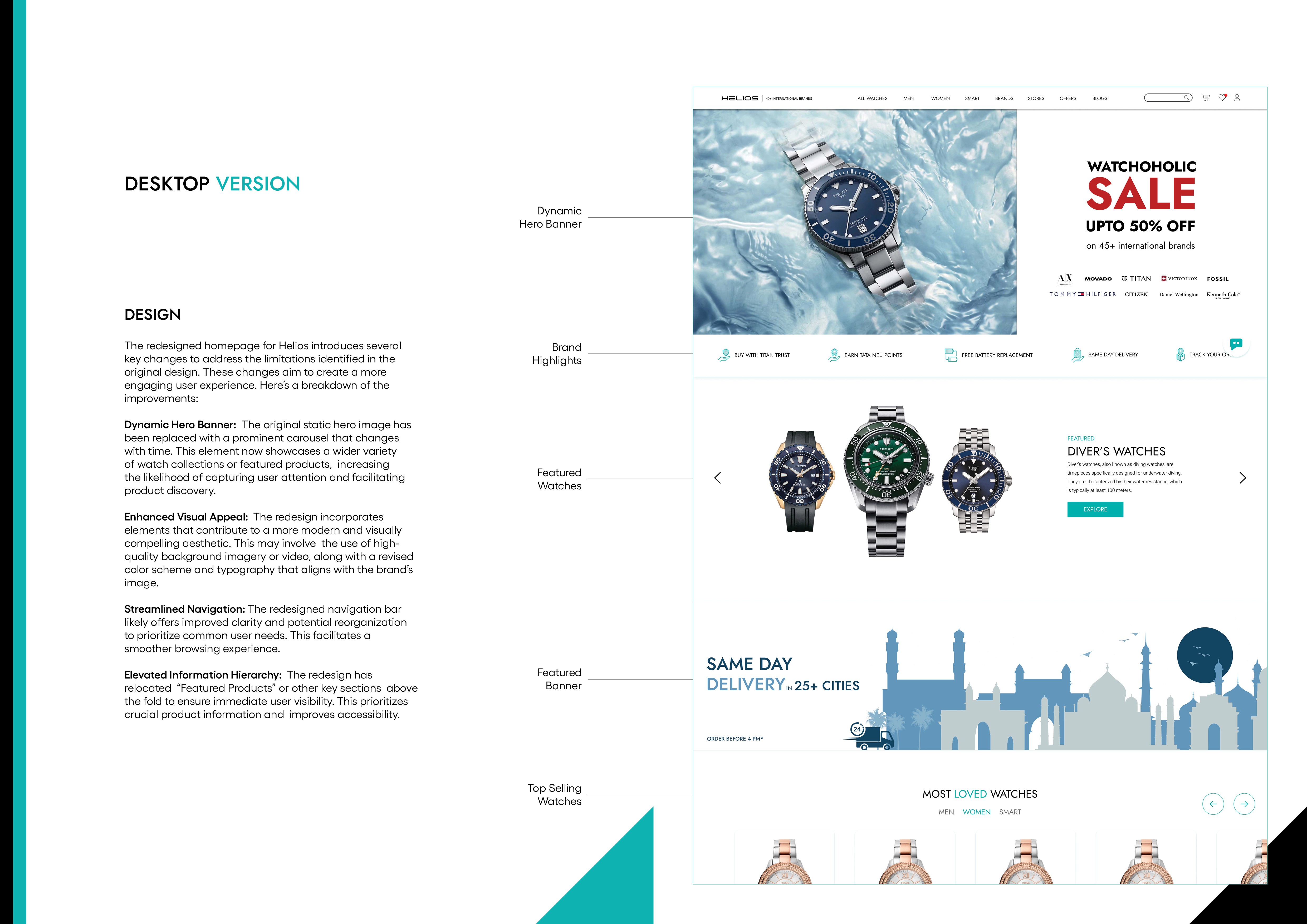
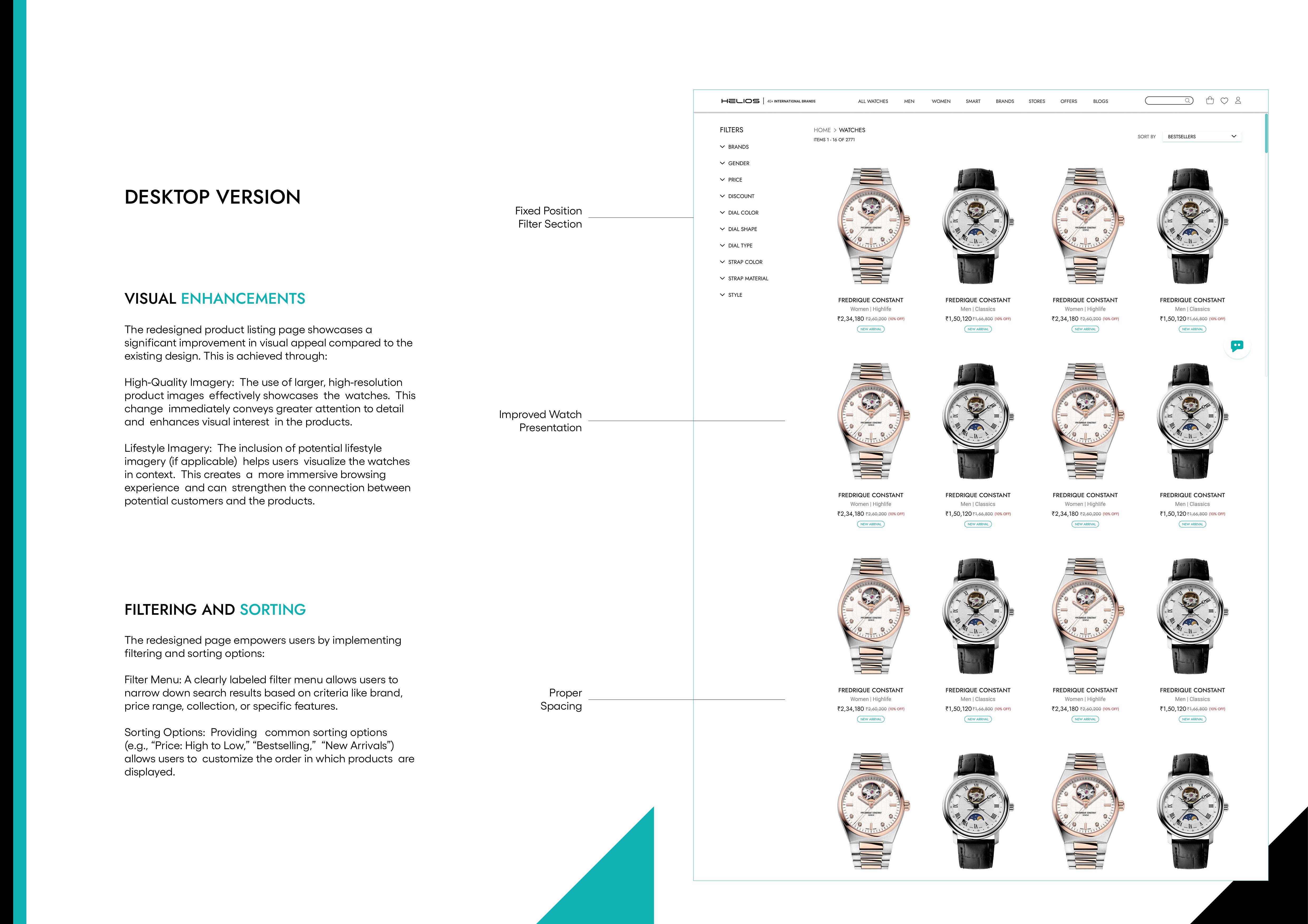
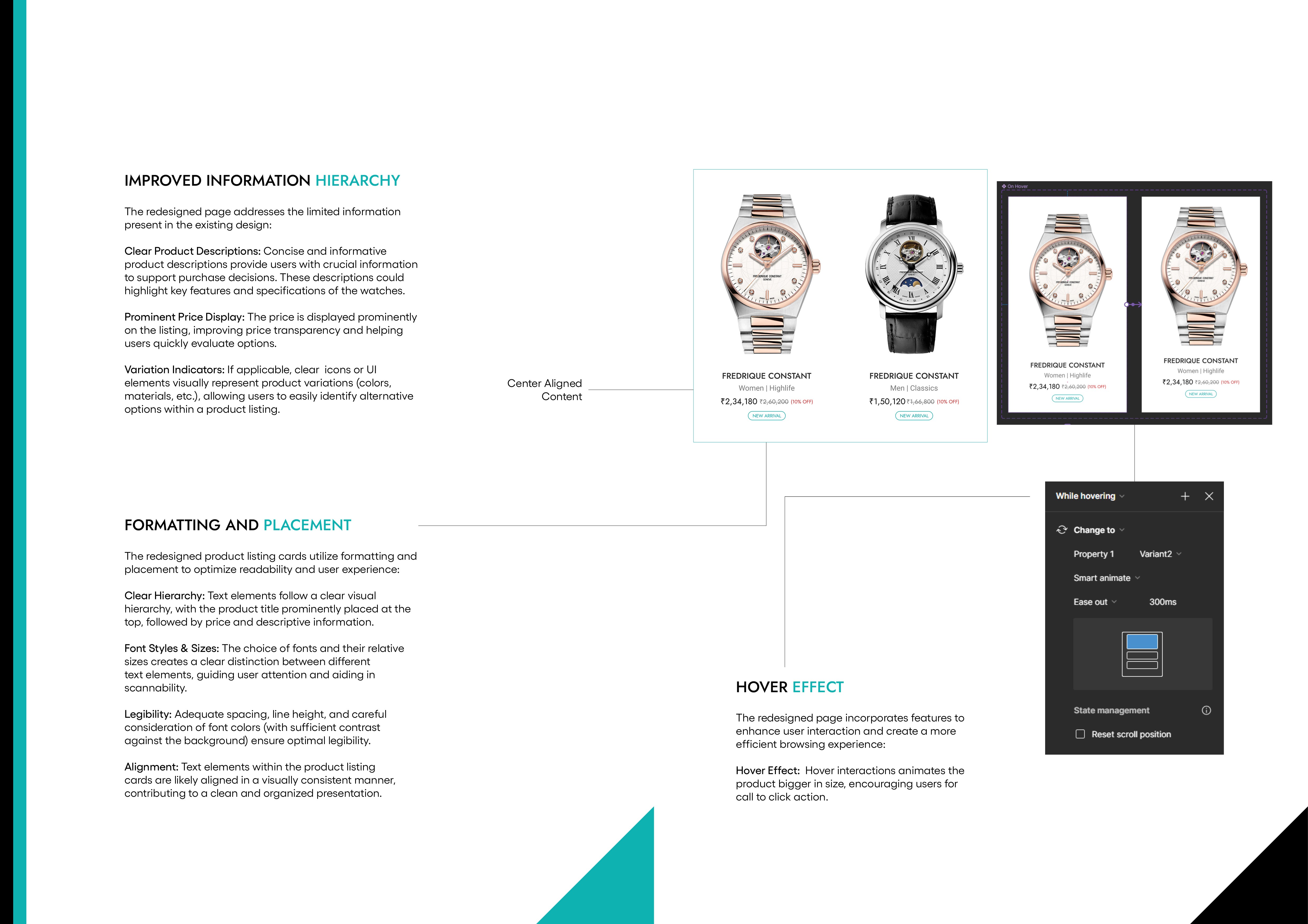
Design
Design
The redesigned identity reflects Zepto’s speed and reliability through vibrant colors, dynamic typography, and a fresh logo that embodies quick commerce. The lightning-inspired "Z" in the new logo symbolizes speed and energy, reinforcing the brand's commitment to ultra-fast deliveries. The design system extends across app interfaces, packaging, marketing collaterals, and digital assets, ensuring a cohesive brand presence across all touchpoints.
The redesigned identity reflects Zepto’s speed and reliability through vibrant colors, dynamic typography, and a fresh logo that embodies quick commerce. The lightning-inspired "Z" in the new logo symbolizes speed and energy, reinforcing the brand's commitment to ultra-fast deliveries. The design system extends across app interfaces, packaging, marketing collaterals, and digital assets, ensuring a cohesive brand presence across all touchpoints.

Development
Development
The packaging design for the rapid delivery service Zepto emphasizes speed and efficiency through its vibrant color palette and clean design. The color combinations create a sense of energy, while the simple layout conveys a feeling of straightforwardness and quick service.
The packaging design for the rapid delivery service Zepto emphasizes speed and efficiency through its vibrant color palette and clean design. The color combinations create a sense of energy, while the simple layout conveys a feeling of straightforwardness and quick service.


More Works More Works

Email: roskrdesign@gmail.com
Designed by Roshan Kumar
Email: roskrdesign@gmail.com
Designed by Roshan Kumar
©
©
©